Home \ Case Studies \ Going beyond the pixels
GOING BEYOND THE PIXELS
Humanising SAP HCM Experience
EXPERIENCE DESIGN CASE STUDY
Kortain is a unified e-platform for overseeing the Human Resources and intends at providing the latest technology in SAP HCM. I helped Kortain humanizing their entire HRMS user experience.
Kortain provides many benefits and services for nearly 55k Government employees and decision-makers of Qatar, which includes e-recruitment, personnel management, performance management, time management, compensation management, task management, learning and development and many more.
Kortain mobile app eases access to the e-services provided by the system around the clock and anywhere.
My Role
I was part of an ambitious design and engineering team and contributed for Wireframing, UI Design, Interactive prototyping and User testing by closely collaborating with business, end-users, engineering and research team. I developed a scalable design system for setting up the standards and maintaining consistency for later design extensions.
Results
-
Improvement of user engagement and well-being by +50%.
-
25k happy native mobile users.
-
Newly designed web and mobile applications are now 80% faster.
-
Unwanted user navigations are reduced by 50% which is saving employee’s valuable time.
*To comply with my non-disclosure agreement, I have eliminated confidential data in this case study. All information in this case study is my own and does not necessarily reveal the views/data of Kortain. Kortain is a hypothetical name given instead of using the real customer's name.
Uncovering the real problem.
After talking to Kortain's human resource department we realized that they wanted to reduce the workforce from doing manual paperwork and divert that revenue to newer initiatives. We gradually started seeing their business objectives and at one point we realized that our new solution should help Kortain increase the user acquisition and retention rate.
We interviewed Kortain employees to understand why they were unhappy about the exiting digital solution. We identified that manual paper work was more efficient for them and they didn't have enough time to operate a digital application.
Actually, Kortain never had a mobile friendly solution for it's HCM services and they were only operating on legacy engines. The UI screens were dynamically generated in the runtime based on the system's dataset rather than what user wanted to see.
Due to lack of responsiveness of the existing digital platform and an unstructured/humongous information structure it was not functional, hence it's acquisition rates were extremely low.
Upon investigating the platform landscape fully and talking to end-users I realized why the redesign was crucial for Kortain.
Many of the users were complaining about longer loading time while using the web portal. I further studied and realised that it was because of bad information hierarchy with poorly presented data which resulted in slower performance.
Managers and Directors are frequent flyers and don’t prefer carrying heavy laptops during their travel. Accessing web portal on mobile devices was a serious pain. Upon further examination, I found that the portal was not responsive and it was necessary to expose specific features through native mobile apps for employees to smoothen their everyday workflow.


Kortain’s applications help to easy supervision of human resources, business processes and data which employ multi-level process workflows.
Before redefining application's design and architecture I proposed understanding the user’s feelings, why they seem frustrated or unhappy.
Upon analysing the end user’s emotion I realized that everyone is looking for a user-friendly application which can provide below functionalities.
-
Quick, easy and secure access of data.
-
Efficient and accurate process tracking.
-
Easy collaboration.


We re-engineered SAP’s Fiori enterprise design system and carefully crafted the UIs that became even more rich and powerful.
Our initial aim was to design a light-weight native mobile application which can provide all the necessary features of SAP HCM platform and later extend its functionalities to the new web portal.
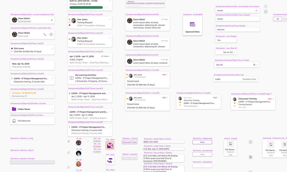
Combination of the Table view and Master-Detail layout helped us to scale the mobile designs and support higher resolution devices. While designing row objects for the master layout I had space limitation but at the same time, I had to show sufficient information that should help users to easily interpret the data and take necessary decisions without even going inside the detail screen.

We went back to the drawing board and tried several possibilities and ended up with a 4 line object cell component which we designated as a parent. I redesigned the new parent object cell with atomic design principle which can be easily customisable with several atomic elements. The parent object cell contains 4 horizontal text views with 3 indicators, one image view, a hairline separator and one chevron indicator.
Information hierarchy and priority can be adjusted for the new object cell's text view elements that will help users to easily understand the data. Also, each atomic element's behaviour and property can be changed individually depending on the data model.
Later we used the parent 4 line object cell and derived a few more components to accommodate the needed information for additional use cases and exceptions.

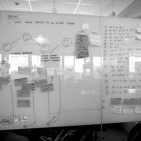
Stakeholder engagement and UX research helped me identify the top tasks, and tiny tasks which I grouped to derive the taskflow for each use cases.
Using SAP fiori components and custom components I later created meaningful wireframes for individual task flows and finally joined them together for an end-to-end user testing.


Every Click Matters!
I re-designed the information architecture and introduced 3 level user navigation structure (Overview, Detail and Selection) which remained consistent across all applications under Mawared.

A more inclusive design.
Our end-users were of many different age groups and nearly 40% of them were either senior citizens or above 45 age with a varied educational and cultural background. This encouraged us to consider an inclusive design approach that works for everyone easily and seamlessly.
The e-accessibility feature was also missing in the older web portal which was causing some drop-off and dissatisfaction. We addressed that by introducing Mada’s e-accessibility guidelines.
Design system
SAP HCM is a complex use case and bringing its capabilities to a native mobile application necessitated 150+ UI screens and 50+ reusable components. And we aimed to deliver the entire project in 4 phases.
To maintain consistency and ensure efficient handover in succeeding phases, I developed an atomic design system based on reusable components and their states. Every component can be rearranged and combined with others while maintaining design consistency and recognizable UI patterns for the user.
Considering the platform ecosystem design guidelines I developed two versions of the design system both for Android and iOS.
Lastly a positive outcome and much more to do...
Many users were complaining about longer loading time, complicated UI with a poor display of information which was causing higher user dissatisfaction and drop-off rate.
While engaging with end-users we were surprised to see how excited they were to use the newly launched Mawared mobile app. We started our usability program and our data revealed that:-
-
Users including senior citizens are not spending more than 30 secs for any activity like applying a Leave request or loan request, approving a time correction task etc.
-
Considering a decent network connectivity maximum loading time for any screen is not more than 300-500 milliseconds.
-
User navigations are reduced by 50%.
-
Nearly 25k users have happily adopted the new mobile application


